In today’s digital landscape, mobile optimization isn’t just a nice-to-have feature—it’s absolutely essential for your website’s survival. With over 60% of web traffic now coming from mobile devices, failing to optimize for mobile users means missing out on significant business opportunities.
💡 The reality: While you’re considering mobile optimization, your competitors are already implementing it. Potential customers are making purchasing decisions based on mobile experiences, and businesses that prioritize mobile optimization are capturing more market share.
This comprehensive guide will walk you through everything you need to know about mobile optimization, from understanding user behavior to implementing technical improvements that will transform your mobile experience.
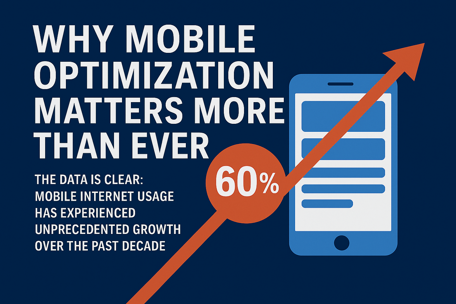
🚀 Why Mobile Optimization Matters More Than Ever
The data is clear: mobile internet usage has experienced unprecedented growth over the past decade. However, what many business leaders overlook is that mobile users demonstrate fundamentally different behavioral patterns compared to desktop users.
⚡ Key insight: When users encounter navigation difficulties on mobile devices, they typically abandon the site immediately. This directly impacts conversion rates and leads users to seek alternatives from competitors who provide superior mobile experiences. This makes mobile optimization a direct factor in your business success, affecting everything from user engagement to search engine rankings.
Understanding Mobile User Behavior 🔍
Mobile users have unique behaviors:
- Shorter Attention Spans ⏰: Provide immediate value and clear navigation.
- Frequent Sessions 🔄: Mobile sessions are shorter but occur more frequently throughout the day.
- Content Preferences 🍿: Users prefer quick, scannable content.
- Touch-Based Navigation 👆: Design for touch interactions, not just clicks.
The Mobile-First Strategy 🚀
Prioritize mobile from the start! Rather than adapting desktop experiences for mobile, a mobile-first approach ensures your design caters to mobile users’ unique needs, improving engagement and conversion rates.
Responsive Web Design: The Foundation 📐
Responsive design adapts to all screen sizes:
- Fluid Grids 🌊: Scalable layouts that adjust based on screen size.
- Adaptive Images 🖼️: Images resize automatically for optimal display.
- CSS Media Queries 📱: Style changes based on device characteristics.
Mobile Content Strategy ✍️
For mobile users:
- Concise Formatting ⚡: Short paragraphs (2-3 sentences max) for easier reading.
- Clear Information Flow 🗺️: Use descriptive subheadings and simple navigation.
- Priority Content 🎯: Highlight the most important info for quick access.
Visual Optimization 🎨
- Image Compression 🗜️: Use formats like WebP for faster loading times.
- Video Optimization 📹: Ensure smooth playback on all devices using HTML5 video.
- Typography 💬: Choose legible fonts and ensure proper spacing for readability.
Performance Optimization ⚡
Page speed is crucial—delays impact conversion rates:
- Optimize Requests 🔗: Minimize HTTP requests by consolidating files.
- Image Optimization 🖼️: Compress images for faster loading.
- Caching Strategy 💾: Leverage browser caching to reduce server load.
Mobile Navigation & Interface 🧭
- Simplified Navigation 📱: Use user-friendly systems like hamburger menus.
- Touch Target Size 👆: Ensure buttons are large enough (at least 44px) for easy touch.
- Ergonomics 🤳: Place elements in easy-to-reach spots for users.
Testing & Continuous Improvement 🛠️
- Use Development Tools 🔧: Test responsiveness using browser tools.
- Real Device Testing 📱: Conduct testing on multiple devices to catch device-specific issues.
- A/B Testing 🔄: Experiment with designs to see what works best for your users.
Common Mobile Optimization Challenges ⚠️
- Small Touch Targets ❌: Buttons that are too small can frustrate users.
- Intrusive Pop-ups 🚫: Avoid full-screen pop-ups that disrupt the user experience.
- Unoptimized Images 📷: Large, uncompressed images slow down your site.
The Future of Mobile Optimization 🔮
Mobile optimization continues to evolve with new trends like voice search, progressive web apps, and mobile-first indexing. Stay ahead by adapting to these changes to better meet user expectations.
Next Steps 🚀
Start by evaluating your own mobile experience. If you find usability issues, your users likely do too. Prioritize mobile optimization to enhance user engagement, boost conversions, and capture more market share.
Check out our latest LinkedIn post to join the conversation on mobile optimization and its future.
Also, don’t miss our previous article: Graphic vs UX Design: Digital’s Creative Battle.
Leave a Reply
You must be logged in to post a comment.